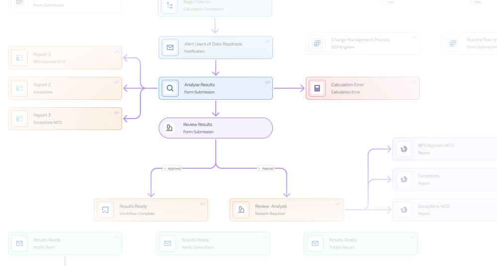
01 Segmented tasks on a linear progress bar
The Daily LCR Analysis became clear, ordered steps, so owners and reviewers could see at a glance where a task sat and who held it.

The solution

The Daily LCR Analysis became clear, ordered steps, so owners and reviewers could see at a glance where a task sat and who held it.

The relevant asset stays visible on the left while workflow actions sit on the right, so analysts stop losing their place to tab-switching.

The Calculation Peer Review step made review part of the process rather than a message sent somewhere else.

Errors get handled inside the system: a failure spawns a child workflow and blocks what depends on it instead of stalling silently.

Forms captured user and action metadata automatically, so the audit trail was a by-product of doing the work.

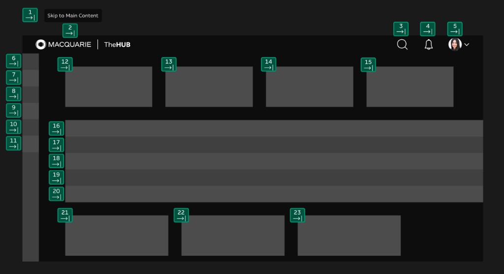
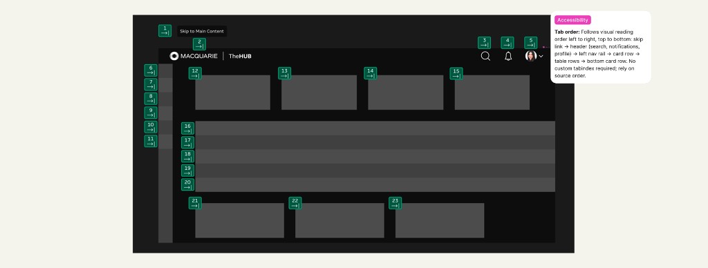
Semantic structure, keyboard navigation and screen-reader paths were mapped and documented, and QA treated accessibility as a condition of completion.
The process
Problem
At its worst, three teams running the same formula in three spreadsheets produced three different numbers for the same data. That was serious enough that APRA raised Macquarie's liquidity coverage ratio and held back more than $6B in operational capital.
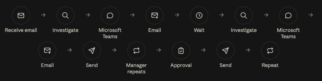
MARS was the response, and Workflows was the part that took the manual processes underneath it — from an analyst tracking a number to the scenario analysis behind buying an airport — and gave them segmented, auditable structure.
Process
Across the work I used AI to synthesise research and capture decisions in product sessions, so more of my time went to the design itself.
The business
I engaged product owners, senior managers, directors and business-team representatives, and reviewed process maps and standard operating procedures. I didn’t have access to broader strategy documents or OKRs, so I grounded the work in the process artefacts and compliance requirements I could actually see.
The platform
The tool was Unqork, with limited design flexibility. I explored its constraints and integration needs early so the MVP — the Analyse, Review, Publish flow for the Daily LCR Analysis — was feasible from the outset rather than a nice idea we couldn’t build.
The users
The personas I inherited were outdated — built through biased analyst research or diluted as they were retold. I ran a workshop with the first real users to map their routine and exceptional processes and undocumented workarounds. It surfaced what shaped everything after it: these users had been sold failed platforms before, so trust had to be earned with visible value early.
Iteration
To get past Unqork’s rigidity I co-developed a custom React wrapper with the engineers, and that uplift is what made the side-panel model possible.
MVP
Formalised as clear segmented tasks on a linear progress bar, so owners and reviewers could see at a glance where a task sat.
Release 1.1
Added the approval step, bringing review inside the workflow instead of alongside it.
Release 1.2
Introduced parent-child workflows for handling errors, so failures were contained and their downstream effects were visible.
What landed
The side-panel model — only possible because we engineered around the platform — which cut context-switching.
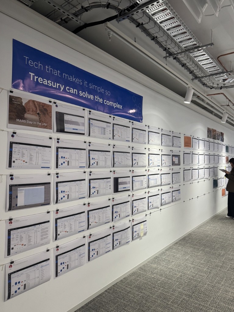
Walk-the-wall sessions: printed screens, sticky-note feedback, refinements brought back the next day. We moved to these after Figma walkthroughs left stakeholders lost in the detail, and the physical format earned the buy-in and trust the workshop said we needed.
Configurable, audit-ready forms that captured user and action metadata automatically.
Accessibility built in: semantic structure, keyboard navigation and screen-reader paths mapped and documented, with QA treating accessibility as a blocker to completion.
What needed work
The inherited user research was unusable and had to be rebuilt from scratch before real design could begin.
The richer experience existed only because we engineered around Unqork, not because the platform supported it — which was fragile and slow.
Handover
The Dev Mode annotations covered visuals, interactions and edge cases. I stayed close through the build for real-time questions and iteration, and worked with QA to verify edge cases and error states — with accessibility treated as a blocker to completion, not a backlog item.
What I’d do differently
We lost time trying to walk stakeholders through Figma before switching to printed walk-the-wall sessions, which is what actually built understanding and trust. Next time that’s the starting format, not the fallback.
Impact
Structured steps, embedded documentation and clearer ownership meant a process could be audited as-is.
Stakeholders could update a workflow without deep technical knowledge, which reduced mistakes.
Process owners could see who was responsible for what, and when.
A simpler interface helped people complete complex processes with more confidence, and they favoured it over what they had.
Impact here is qualitative by design — this was internal platform work measured by whether a process could be audited as-is, not by a conversion number.