01 Commentary in the report, not beside it
Analysts capture the reasoning where the numbers live, as they work, instead of rebuilding it later from Excel notes and Teams messages.
Hero — Insights overview
Features
Analysts capture the reasoning where the numbers live, as they work, instead of rebuilding it later from Excel notes and Teams messages.
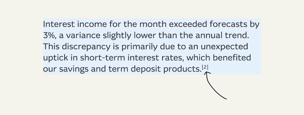
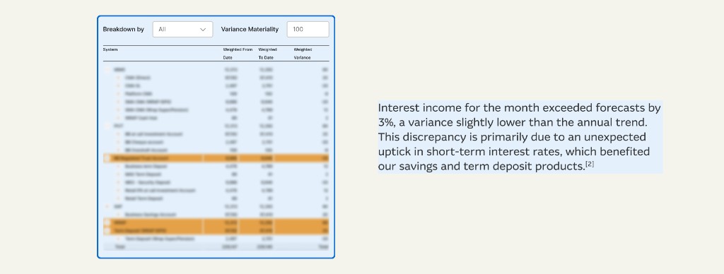
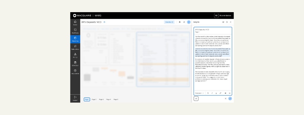
PowerBI visuals couldn't be named consistently without user input, which broke the tagging concept. Footnoting — a convention analysts already knew from technical and academic work — connected commentary to visuals without depending on named elements.
Tagging or hovering a footnote elevates its visual on the page. Developers first called it unfeasible; once I showed how much clarity it bought, they reinvestigated and shipped it.
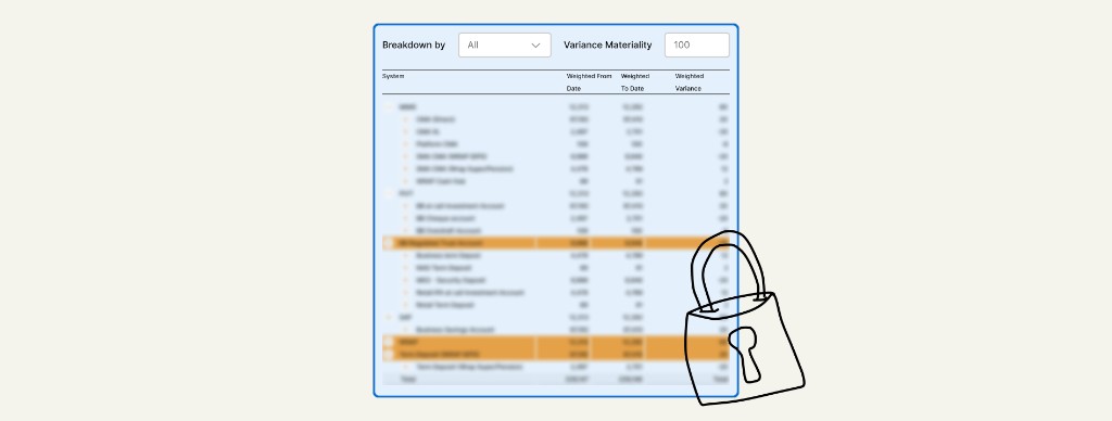
Commentary that references a visual captures a frozen version of it — filters and data state intact. This is the piece that made audits genuinely easier.
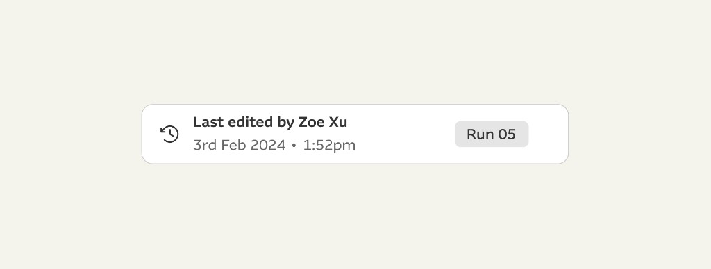
Recalculating a report wipes and replaces all its data, even for a one-value change. Tying history to the run meant commentary survived recalculation instead of being destroyed by it.
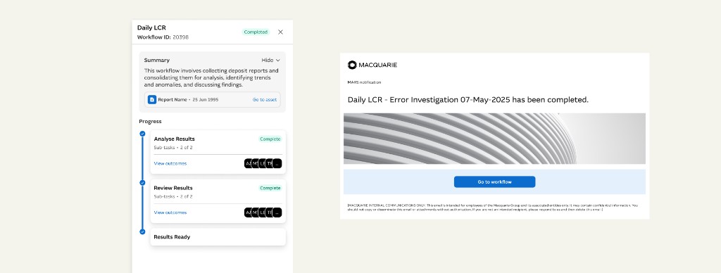
The daily summary analysts had been rebuilding by hand became a structured, formattable artefact they could carry forward and send on.
The process
Problem
Treasury runs on multi-billion-dollar decisions made every day across spreadsheets, dashboards, email and Teams. That sprawl is why MARS existed — at its worst, the same formula in three spreadsheets gave three teams three different numbers for the same data.
Insights took on one specific edge of that problem: the rationale behind a report was never captured where the report lived, so looking back was slow and fragmented, and risked losing the exact context an audit depended on.
Process
While building the comments feature I sat with analysts and found a daily ritual: they consolidated the day's findings and emailed a formal summary to stakeholders, rebuilding it from scratch each time. It wasn't on the roadmap, but the user value clearly outweighed other planned work, so I advocated to prioritise it and the team adjusted scope.
With the lead developer and feature analyst I scoped what was realistic for the MVP — a plain text box, no formatting or tagging. Alongside it I mapped the strategic version and made sure the backend was structured to support tagging, visual references and interactivity later, so the ambitious version wouldn't need a rebuild.
Analysts wanted to reference visuals and data the way they already did with screenshots and Excel comments. A hard constraint surfaced early: PowerBI visuals couldn't be named consistently without user input, which broke tagging — so I pivoted to footnoting, a pattern they already knew.
I designed around how analysts already worked rather than against it, and validated on the wall with printed sketches as well as on screen, so the team could engage with it physically. Testing was strong: it solved a real daily pain and cut the tool-juggling. Across the work I used AI to synthesise research and capture decisions in product sessions, so more of my time went to the design itself.
Iteration
What landed
The footnoting pattern made referencing intuitive by borrowing a convention analysts already used.
Snapshot mode: commentary referencing a visual captured a frozen version of it, filters and data state intact — the thing that made audits genuinely easier.
Version history tied to each calculation run, so recalculating a report no longer destroyed the commentary attached to it.
The visual-highlight state that started life as “unfeasible.”
What needed work
PowerBI visuals couldn't be named consistently without user input, which blocked clean tagging. We worked around it with footnoting; an AI-generated naming solution was planned for a later iteration rather than built at the time.
The MVP was deliberately minimal — a plain text field — while the backend was readied for more, so the earliest users saw a fraction of the eventual value.
What I’d do differently
We explored footnoting early, the product team parked it, and it turned out to be the right answer precisely because analysts already knew it from their technical and academic work.
I'd have pushed on it sooner by thinking harder about how these specific users think, not just which solution is most elegant. In internal tools especially, the existing mental model usually beats the better idea.
Impact
01
Rationale was captured in the report as analysts worked, instead of reconstructed from scattered notes when an audit landed.
02
Snapshots and version history meant the exact data state behind a comment survived recalculations and stayed referenceable.
03
Footnoting anchored each insight to the specific visual and data it referenced, so reviewers knew exactly what a comment was about.
04
The feature mirrored existing habits — footnoting, and reusing end-of-day commentary — which is what drove uptake.
Impact here is qualitative by design — this was a 0 → 1 internal feature measured by whether the reasoning behind a report survived an audit, not by a conversion number.