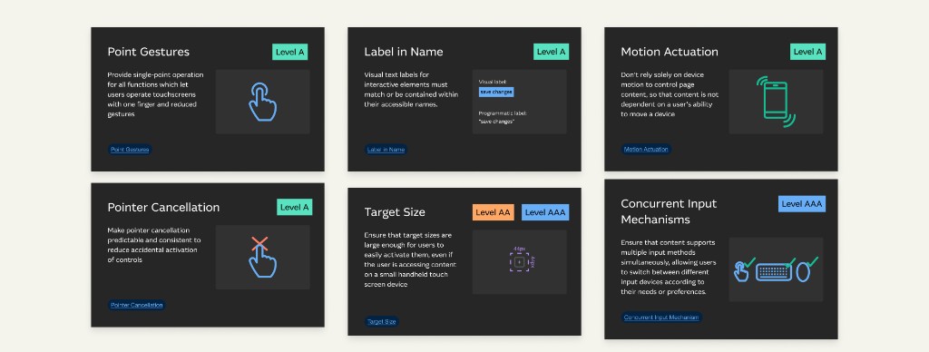
01 Guidance built into the component
Best practices, accessibility guidance and technical requirements were embedded in the components themselves, which cut ambiguity for the designers using them.
The solution
Best practices, accessibility guidance and technical requirements were embedded in the components themselves, which cut ambiguity for the designers using them.
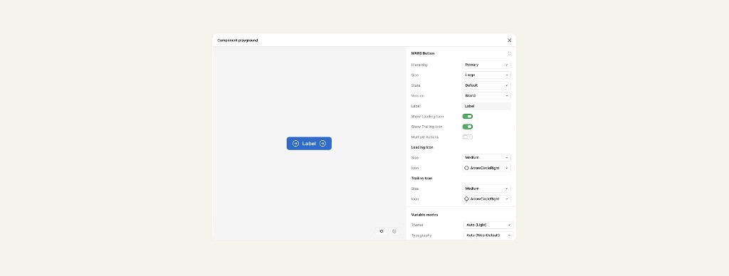
Each component shipped with clear presets — padding, corner radius, interaction states — while flexing through controlled variables: size, colour, icon placement, label text. Enough felxibility to cater to different teams use cases, but not enough to go rogue
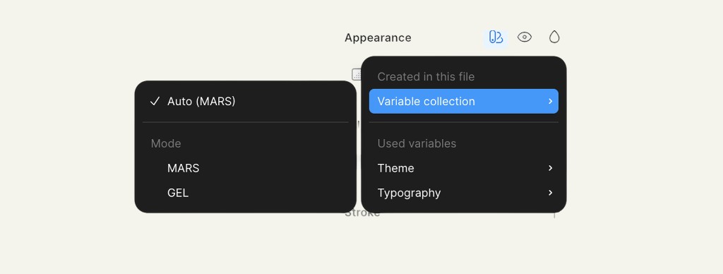
Figma modes tied to Macquarie brand variables adjusted brand-restricted properties automatically — the 0px radii and regulated fonts brand foundations required — so one component served Group Treasury and the wider system without being detached or rebuilt.
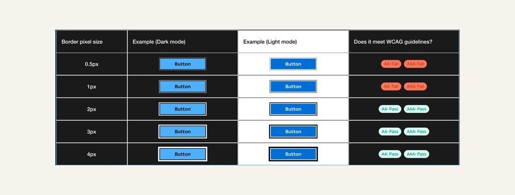
Every component was built to meet AA, and AAA where it was right, so any designer pulling from GEL inherited compliance rather than engineering it themselves.
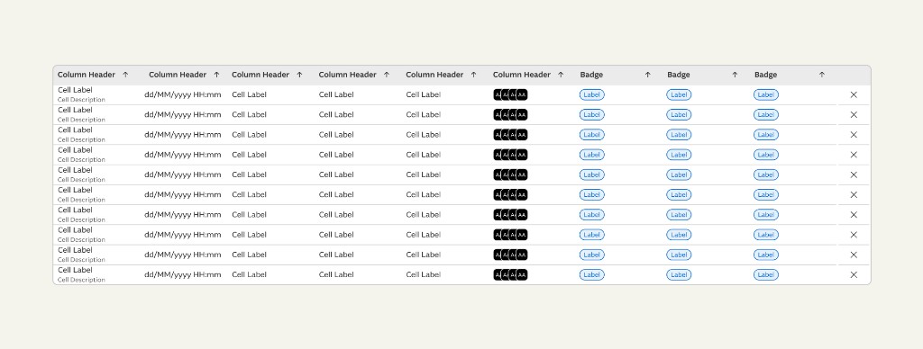
Foundations first, then atomic components as real needs surfaced — an architecture that let divisions adopt incrementally instead of migrating wholesale.
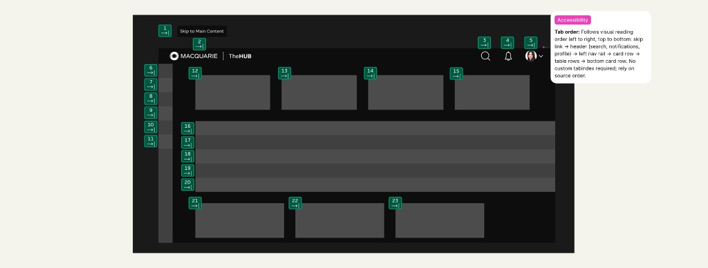
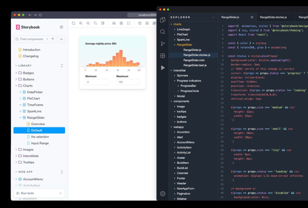
Accessibility documentation per component, plus Dev Mode specs for spacing, tokens and interaction, reviewed against the Storybook build with the engineers.
Impact
01
80%
Adoption across Corporate Operations Group design teams — four of five — with the fifth integrating GEL into its existing system rather than starting over.
02
3 → 30+
Components, on an atomic model that flexed across divisional branding through Figma modes and brand variables.
03
100+
Internal tools brought onto consistent foundations, reducing the visual inconsistencies and usability issues that had driven bug fixes and support overhead.
AA throughout and AAA where appropriate, so any designer adopting GEL inherited WCAG compliance instead of engineering it per product.
Front-end developers stopped rebuilding design-system elements. Conservatively this could save several full-time-equivalent months a year — an estimate, not a measured result.
Fewer context switches moving between tools, and fewer inconsistencies reaching users as bugs and support tickets.
Controlled flexibility meant teams met their product needs without detaching components — the behaviour that had fragmented the bank's systems in the first place.
The process
Problem
Across the bank, more than 400 internal and customer-facing products were running on fragmented local design systems or none at all. Some divisions had drifted so far they were using Material UI with none of Macquarie's own colour or typography foundations.
The result was a disjointed experience that slowed design and added mental load every time someone moved between tools. GEL existed to close that gap: reduce duplication, enforce consistency, and cut the overhead of switching contexts.
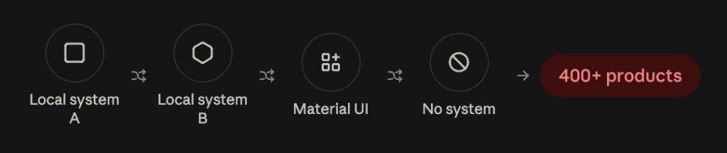
Process
We started against a component roadmap but quickly found it more efficient to design components in response to real needs as they surfaced in Group Treasury day to day.
Accessibility was the thread I owned. We aimed for AAA and stepped down to AA deliberately in the dense, data-heavy interfaces where AAA would have forced type too small or too large to be usable. The standard served the interface, not the other way around.
01
For each new component I audited its use across Macquarie, interviewing lead designers across divisions to surface pain points, requirements and edge cases.
02
Benchmarked against competitors for usability and against WCAG 2.1 for accessibility, so each component started from a defensible baseline rather than a preference.
03
Worked with developers on constraints and the existing frameworks we could lean on, so every component was buildable from the start.
04
Components were crafted first for MARS, then adapted for GEL through Figma modes tied to brand variables — one component serving both without being rebuilt.
Iteration
What landed
Building for MARS first, then generalising, gave each component a real proving ground before it entered GEL.
Accessibility built into each component meant compliance scaled with adoption instead of being re-litigated per team.
The presets-plus-controlled-flexibility model held up — designers met their needs without detaching components.
What needed work
Early time spent comparing large public design systems cost momentum before anything usable existed.
Components first shaped for Group Treasury needed rework to generalise once we ran them past other divisions.
Niche, highly complex cases like advanced trading tables couldn't be solved in the first pass, so we documented the gaps and flagged them for future expansion.
Aligning three co-contributing designers whose availability rarely matched meant working to shared guidelines and sparring components afterwards — prioritising getting the system into designers' hands over making every component flawless first.
Documentation & handover
Once a component was approved I completed its accessibility documentation, while the Design Systems Lead handled the broader system docs.
We leaned heavily on Figma Dev Mode to surface spacing, token usage and interaction specs, and as it was released I brought designers and developers onto it. Developers then built the Storybook and reviewed it against spec with me to confirm it was accurate.
What I’d do differently
We spent too long comparing large public design systems and studying how they'd been done, treating Carbon as a source of truth rather than testing it against what our own teams actually needed. Many public systems lack depth or usability and shouldn't dictate your solution.
What worked was the opposite instinct: build something real for Group Treasury, then correct and generalise it into GEL with other divisions' use cases in mind.
If I did it again I'd evaluate our ways of working up front — agile, waterfall or hybrid, to suit the context — invest earlier in dedicated contributors, and put living documentation directly in Figma so guidance stayed accurate. Gathering every answer before starting was never going to scale across five design teams and fifteen-plus designers, and the momentum lost early was the most expensive part of the project.