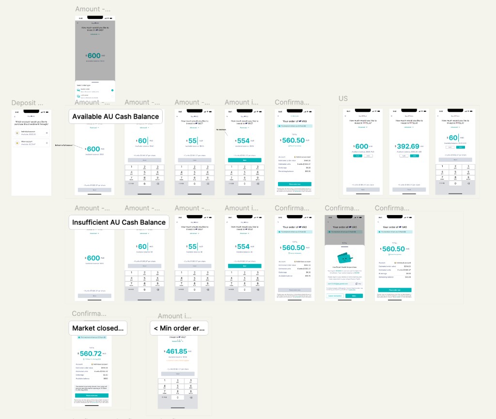
01 Progressive disclosure across buy and sell
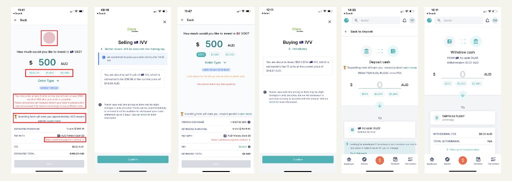
The old experience crammed everything onto one screen. The new one steps users through with a clear hierarchy and tucks advanced options like limit orders behind expandable sections.
The solution
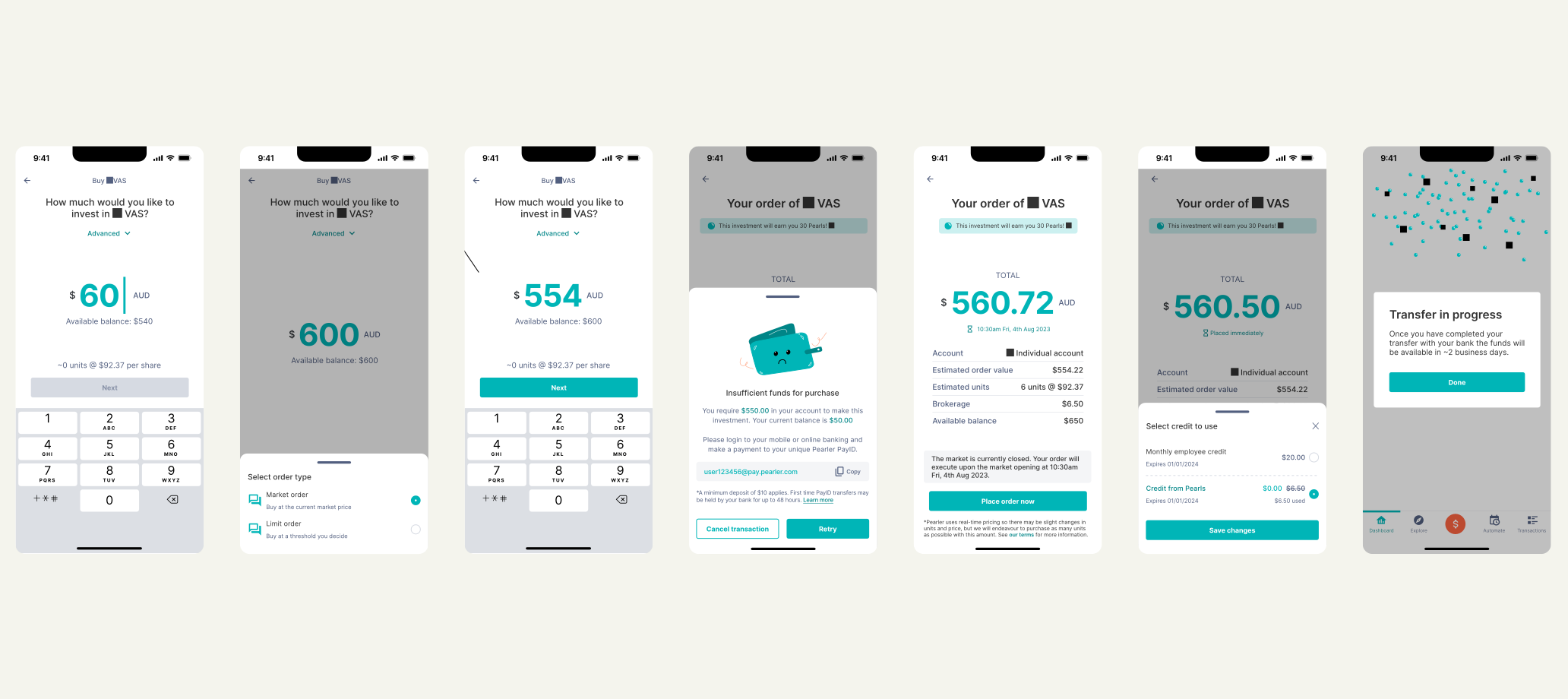
The old experience crammed everything onto one screen. The new one steps users through with a clear hierarchy and tucks advanced options like limit orders behind expandable sections.
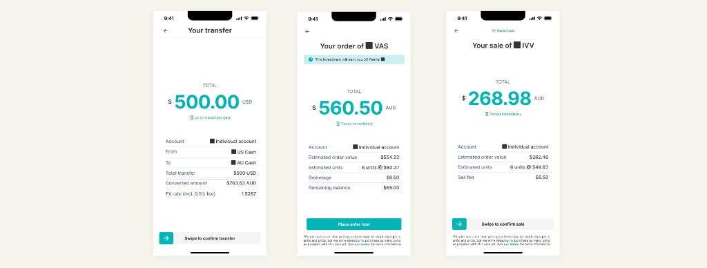
Proceeds, wait time and next steps are shown outright, instead of leaving people guessing after the riskiest tap in the app.

Walls of unformatted regulatory text became friendly, illustrated states — a sad wallet for insufficient funds — without losing compliance.
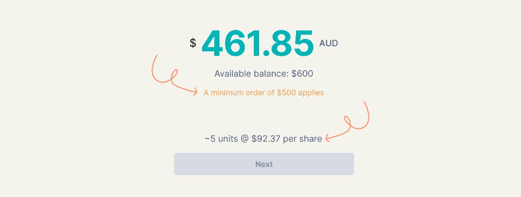
Share-price breakdowns and in-context detail meant users didn't have to hold numbers in their head between screens.

Soft shapes, illustration and a modern palette, built alongside the flows, so the product finally looked like the mission it described.

Motion used deliberately at the high-stakes moments — confirmation, completion — to make an irreversible action feel handled rather than hurried.
Impact
01
Simplifying the flows dropped support tickets about basic money actions, so people stopped needing help with everyday tasks.
02
Complaints on social media declined after the redesign, protecting the brand's accessible, unintimidating promise.
03
Clearer, consistent patterns helped users complete buys and withdrawals with fewer errors, improving satisfaction and retention.
04
A system that matched the CPO's vision brought design, product and engineering into line for more cohesive future work.
05
The patterns became the base for new products like home buying and superannuation, enabling reuse and faster iteration.
Impact here is qualitative by design — measured in support load, sentiment and confidence at high-stakes moments rather than a single conversion number.
The process
Problem
Buy, sell, deposit, withdraw and transfer had each been built by a rotation of short-term contractors with no design system and no shared vision, so they were cluttered, inconsistent and visually uninviting.
Support tickets, user conversations and online forums all told the same story: people were overwhelmed at exactly the high-stakes moments where they most needed to trust the product, and that lack of trust was a direct deterrent to converting new users into active investors.
Process
I mapped and audited the existing flows against design fundamentals, then combined support tickets, Reddit and Facebook discussions, and interviews with six users — from never-invested to active — to find the real pain: information density that overwhelmed new investors, no visual hierarchy, error states that ran three or four dense lines and got tuned out, and an off-brand feel that undercut the promise of clarity.
This was a startup, so the process was lean. Feedback came through Slack and Figma comments, stakeholders and teammates were themselves users, and the customer-service team doubled as research partners feeding me pain points in real time. Without a broader design team to spar with, I anchored decisions in established heuristics and prototyped and tested with users weekly, refining against real feedback instead of my own assumptions.
Progressive disclosure
Limit orders and advanced settings moved behind expandable sections, so the default path stayed simple for first-time investors.
Recognition over recall
Share-price breakdowns and inline detail meant users never had to remember a number from a previous screen.
Jakob's law
Patterns from Robinhood, CommBank Pocket and Wise, so the flows felt known rather than novel.
Hick's law
Each flow stripped back to its primary decision, with everything secondary deferred.
Iteration
What landed
Progressive disclosure across buy and sell: more steps, but one clear decision at a time.
Confirmation screens that show proceeds, wait time and next steps, replacing screens that left users guessing.
Friendly, illustrated error states in place of dense regulatory text, which people actually read.
A brand-aligned visual language that finally matched Pearler’s mission and softened high-stakes moments.
What needed work
Adding steps to lower cognitive load meant justifying a longer flow against the instinct that more screens feels worse. Weekly testing is what settled it.
Making regulatory error states friendly without losing compliance took real care, since the copy had legal constraints I couldn’t just rewrite away.
What I’d do differently
I made the case against the gamified rewards feature more than once. The research was consistent and negative, but the CPO wanted it in the buy and sell flow, and it took the feature shipping and producing no results before it was finally removed.
Knowing that now, if a stakeholder is that set on keeping something the evidence doesn't support, I'd stop trying to win the removal and instead shrink its footprint: a smaller, quieter component that protects the critical path while the decision plays out. Being right isn't the same as being able to move someone, and the design still has to hold up in the meantime.