Image
Title
Body
Hero image placeholder
The solution
Body
Body
Body
Body
Impact
01
16
Research sessions. Two switched through us, four switched somewhere else, ten left with “not right now.”
02
20
Pain points surfaced. The two biggest were operational. Retailer trust was the highest-ranked problem design could move.
03
58.12%
About-provider variant against a 47.88% baseline. Early signal on a smaller sample.
The product's first user research, and a corrected definition of failure: some sessions the funnel logged as drop-offs were comparisons completed elsewhere.
Thirteen prioritised opportunities, ranked by impact and effort. The two most blocking — savings below threshold and bonuses not surfaced — were already being addressed operationally.
A separate product to monitor a plan and alert someone once a switch clears their personal threshold, seeded by ten of sixteen participants deferring rather than declining.
People passed over the cheapest plan when the retailer was unfamiliar. That was the highest-ranked problem an interface could actually address.
The process
The problem
The funnel data showed where people left. It couldn't show why, and every fix on the table rested on an assumption about user behaviour no one had tested. So I ran research across both what people did and what they believed while doing it, because a drop-off point tells you where someone stopped, not what they were thinking when they did.
The problem had a clear origin. A well-known retailer was absent from the platform at the time, which threw the less familiar retailers that were on it into sharper relief, and a survey of OCS users found a large share didn't recognise or trust unfamiliar brands. The team's hypothesis was that showing more about a provider would help people feel these retailers were reputable and safe to switch to. That matched what I was seeing in sessions.
User
People spent real effort connecting their usage and comparing plans, then left with no reason captured.
Retailers and partners
OCS earns on completed switches, so a comparison that ends elsewhere is unpaid effort.
The team
A year of roadmap decisions were about to be made on assumption alone.
The research
What the research found
The two biggest problems were operational, not interface problems, and the research also corrected how the team defined failure in the first place.
I recruited through paid social and graded every finding by the strength of its evidence, verbatim transcript, observed behaviour, or paraphrase from notes, so a single comment couldn't pass as a pattern. AI helped structure the raw records into themes; I reviewed, corrected, and caught data-integrity problems in the source material myself.
The research also corrected how the team defined failure. Several people the funnel logged as drop-offs had completed a comparison and then switched directly with the retailer, using OCS to research and going elsewhere to transact. That is not the product quietly working. OCS earns only when the switch happens through OCS, so a comparison that ends direct is the platform used as free infrastructure. The pattern showed up plainly in the sessions: people signing up direct to avoid a middleman, and rating OCS as less credible than a government comparison site even while preferring its interface. It reads less like a fixable interface flaw and more like a trait of the whole category, where OCS, Compare the Market and Finder are all treated as places to research and then leave. A single screen doesn't overturn that.
Deciding what was mine to fix
Most of the top findings weren't design's to solve, which is what made the one that was worth doing properly.
The two biggest problems sat outside what an interface could move. Savings that fell below someone's personal threshold, and bonuses missing from the panel, are questions of who is on the platform and what they offer, not interaction design. Of five people who left chasing a bonus we didn't show, only two were solvable by better visibility on our side; the other three needed a business development conversation, not a screen. The team was already building the panel out operationally, continuing to grow the largest set of energy providers in Australia, all incentivised the same way with no plan promoted over another.
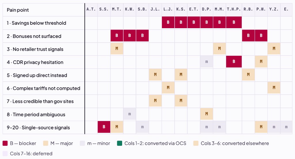
That triage left one high-ranking, design-addressable problem: people passing over the cheapest plan because they didn't recognise the retailer offering it. It is worth being clear about the ceiling on it, though. Distrust of an unfamiliar retailer is really distrust of OCS's recommendation, so the deeper lever is trust in OCS as a product; build that and trust in everything on the panel rises with it. A single component can treat the symptom at the point of choice. It can't manufacture the product-level trust underneath it, which is the thing that would actually move the panel as a whole.
For focus, this case study follows that one feature. I also redesigned the data-connection step in the same period; it is separate work with an experiment still running, so I have left its results out here rather than report an unfinished number.
What needed work
Once there was room, I moved the choice earlier in the flow so it stopped interrupting people at the point they most wanted momentum.
Exploring the form before the placement
About the provider, at the point of choice.
I worked the idea across three fidelities before committing: a compact "about provider" link on the front of the plan card, above the price, rather than burying it in an accordion, since this was a high-ranking pain point and its placement had to match its importance. Opening it surfaces years operating, customer numbers, accreditations, ownership and support, fields chosen specifically to build credibility without inviting a bad number, which is why I deliberately left out third-party star ratings. I worked every field against real character limits so the layout held at its longest actual values, and built the component on tokens so it renders correctly across OCS, Bemoved and affiliate brand skins without a single hard-coded colour. Content itself is maintained by the PM and product lead against those fields, with compliance sign-off, so a correction updates the data, not the design.
Result: the variant converted at 58.12% against a 47.88% baseline, an early signal on a smaller sample, with the effect narrowing further down the funnel at the plan-to-submit step.
Documentation and handover
Every design was annotated with tokens, focus order, states, and error behaviour, and each feature shipped with acceptance criteria so "done" was unambiguous.
Acceptance criteria, about-provider (abridged)
What I’d do differently
Both changes were real improvements by any experience measure, and the about-provider result suggests one of them genuinely helped. But across the board the movement was small, and it would have been easy to present a better experience as if it were driving the numbers. It mostly wasn't. These are low-intent, deal-driven visitors in large part, and a well-made screen doesn't turn a comparison-shopper into a switcher on its own. I'd carry two things forward from this: hold "this is a better experience" and "this moved the metric" as separate claims, and say plainly when only the first is true, and when user intent is the real ceiling, design for intent, not just clarity.