

PEARLER
Money Actions are a unified, brand-aligned system designed to simplify how users interact with their funds — from buying and selling to transferring and withdrawing — by creating consistent, intuitive flows that build trust, reduce friction, and support confident financial decisions.


background
Making long-term investing accessible confusing?
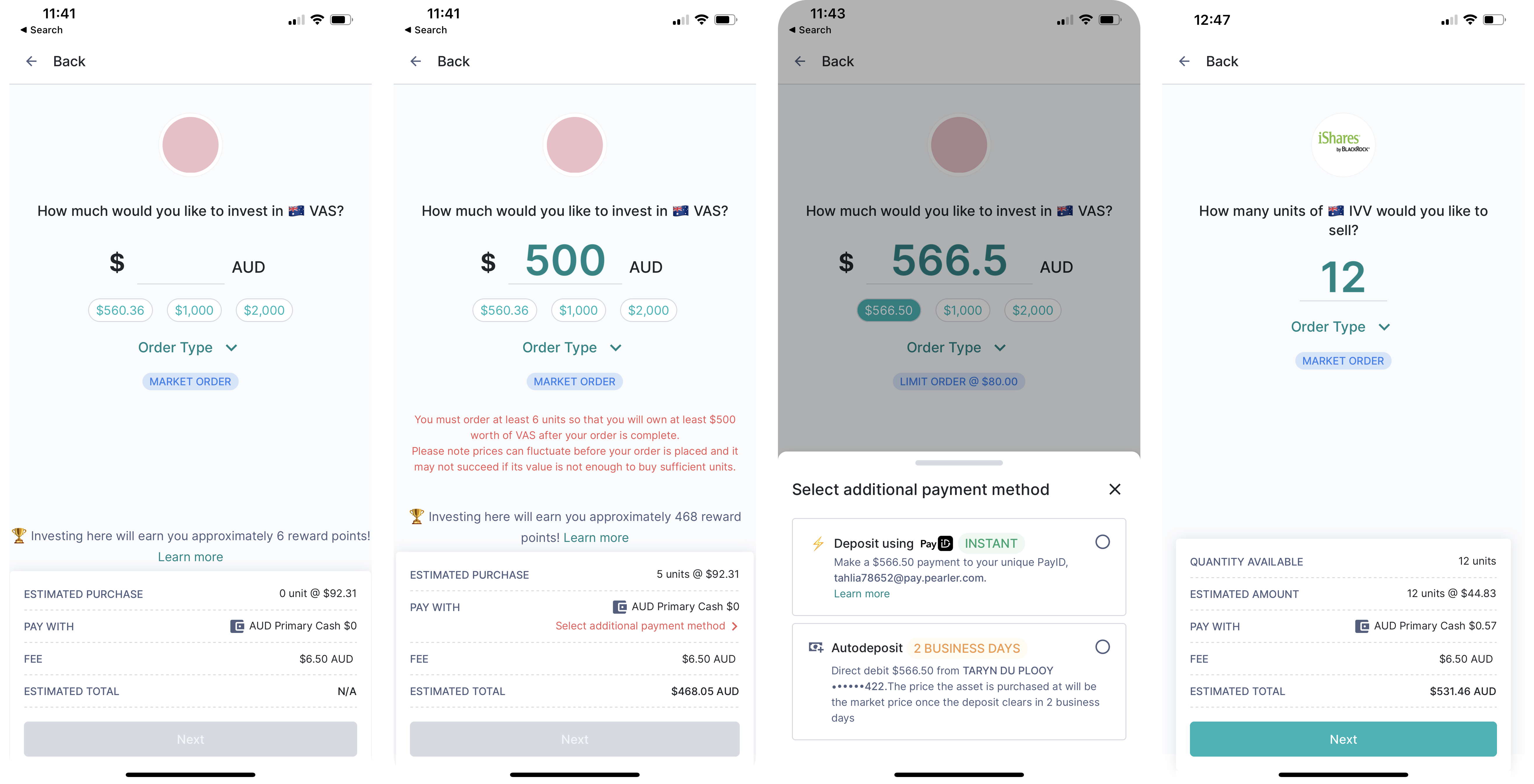
Pearler’s mission to make long-term investing accessible was undercut by disjointed, developer-led interfaces that lacked cohesion, clarity, and usability. A lack of design systems and vision alongside a range of short term contractors pumping out UI work led to features which were cluttered, inconsistent, and visually uninviting.
Customer support tickets, speaking to users, and online forums revealed that the existing experience was confusing users and eroding trust. The experience directly opposed their mission and fell short of guiding everyday Australians through high-stakes financial decisions.
The solution was a strategically targeted redesign of high-impact areas across the platform, starting with core money actions that directly affected user trust, engagement, and conversion.
problem
Confusing, inconsistent money action flows eroded trust and prevented users from converting into active investors.
Core money actions — buy, sell, deposit, withdraw, and transfer — were fragmented and hard to navigate. They were built without shared logic or flow, these screens felt disconnected and overly complex, leaving users overwhelmed during key financial moments.
This lack of trust in a fundamental part of the experience became a major deterrent to converting new users into active investors.
Solution
A unified, system-wide experience replacing fragmented flows that built user trust, improved usability, and laid the groundwork for future growth.
01
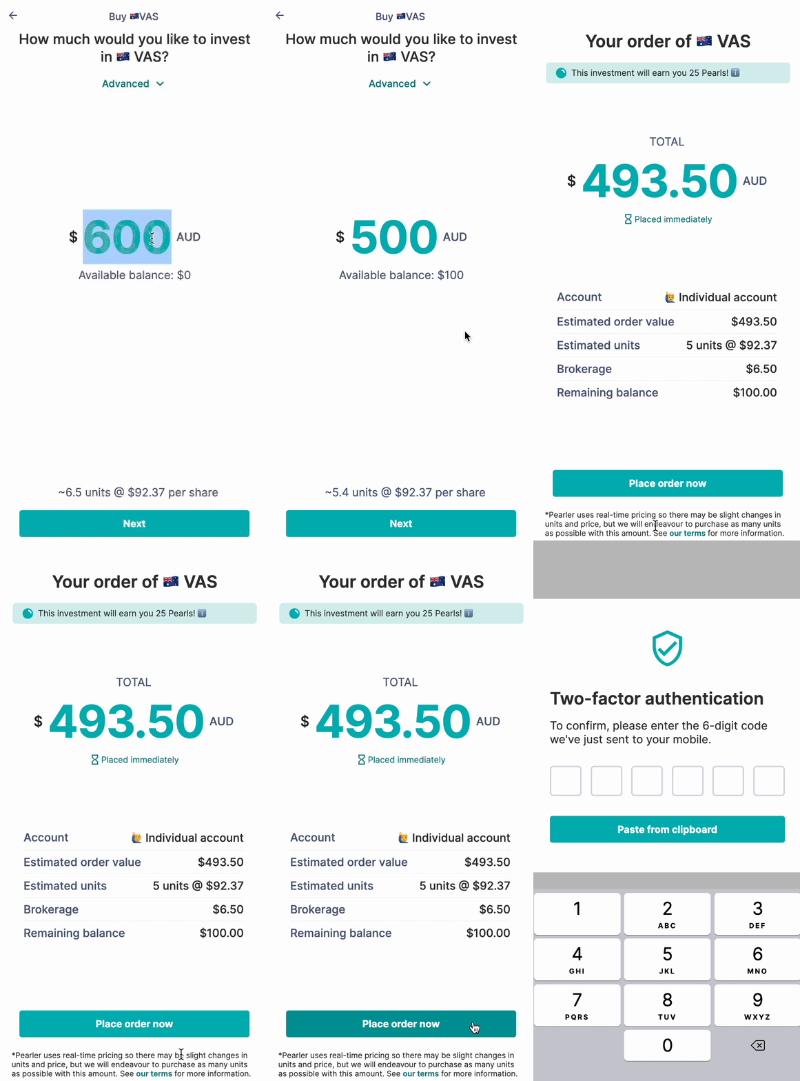
Progressive disclosure and structured layouts to reduce cognitive load and simplify complex decisions.
To address the cluttered and overwhelming screens (where all actions lived in a single view), we introduced a progressive disclosure model—surfacing only the most relevant information at each step.
I restructured each money flow (buy, sell, transfer, withdraw, deposit) into clear, digestible sections that guided users through their tasks sequentially. This helped users focus on one decision at a time, reducing confusion, backtracking, and decision fatigue.
By simplifying interactions and clarifying pathways, users could complete financial actions with more ease, confidence, and reduced stress.

02
Intentional hierarchy and layout for clarity
The lack of design fundamentals made screens difficult to scan and hard to use. We addressed this by introducing a clear visual hierarchy—using spacing, typography, and layout patterns to create order and focus.
Primary actions were made more obvious, and related information was grouped meaningfully. This helped users more quickly understand what they were looking at, where to take action, and what mattered most—ultimately speeding up task completion and reducing friction.

03
Modern, brand-aligned visual design
The existing interface felt cold, outdated, and disconnected from the brand. I redesigned it to reflect Pearler’s mission of accessible long-term investing using soft shapes, friendly illustrations, and a modern colour palette.
I introduced thoughtful animations and micro-interactions to add moments of delight and ease user tension during high-stakes financial actions. These updates helped users feel more supported and confident when interacting with their money.
04
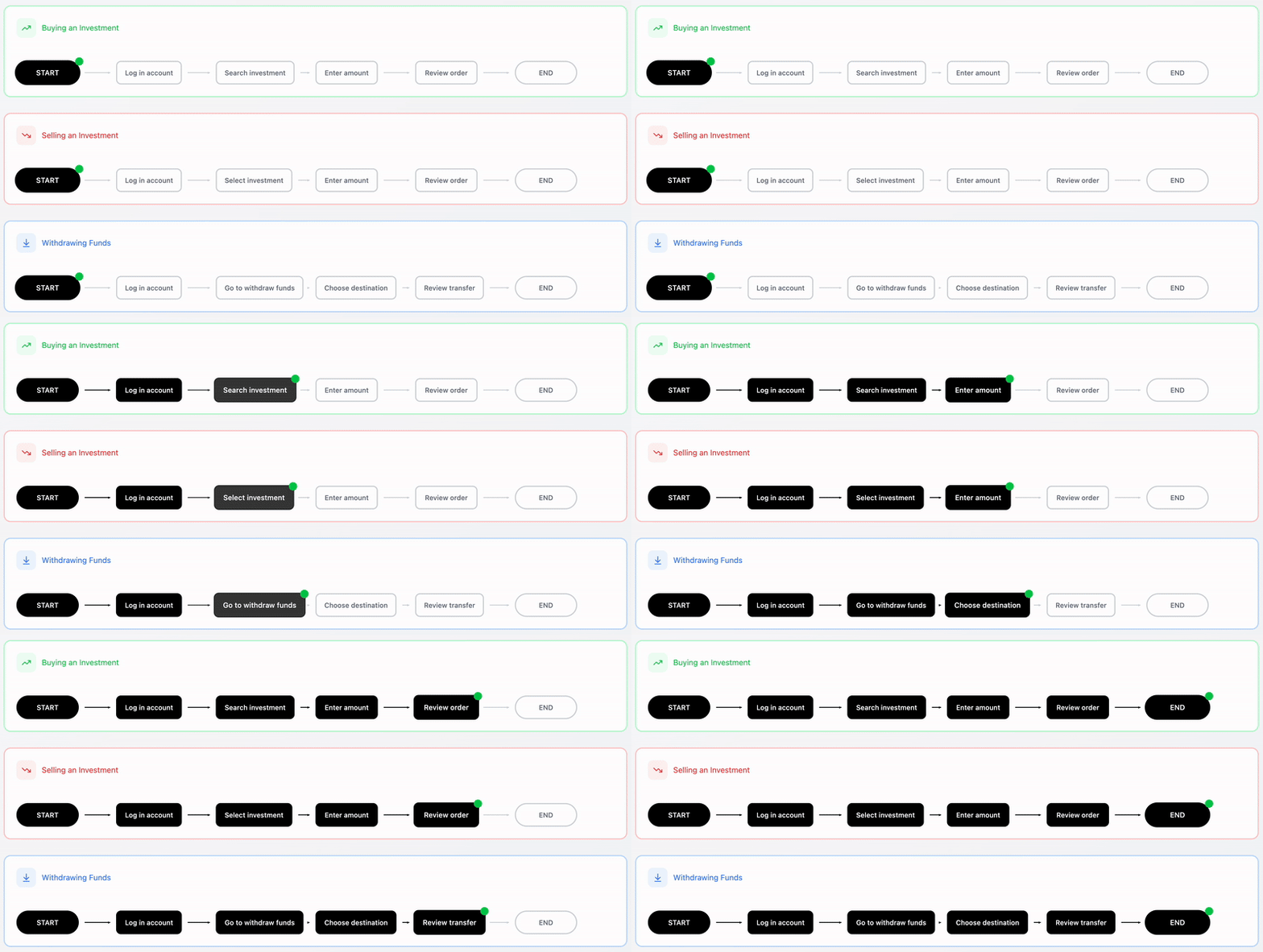
Clear, consistent user flows based in research
The earlier experience had been created with minimal user input which led to confusing and inconsistent flows. I led a research-first redesign process starting by mapping current journeys and identifying pain points.
I prototyped new concepts and tested them weekly with users to validate ideas and refine interactions based on real feedback. This helped ensure the final product was grounded in user needs and delivered a clearer more trustworthy experience.
05
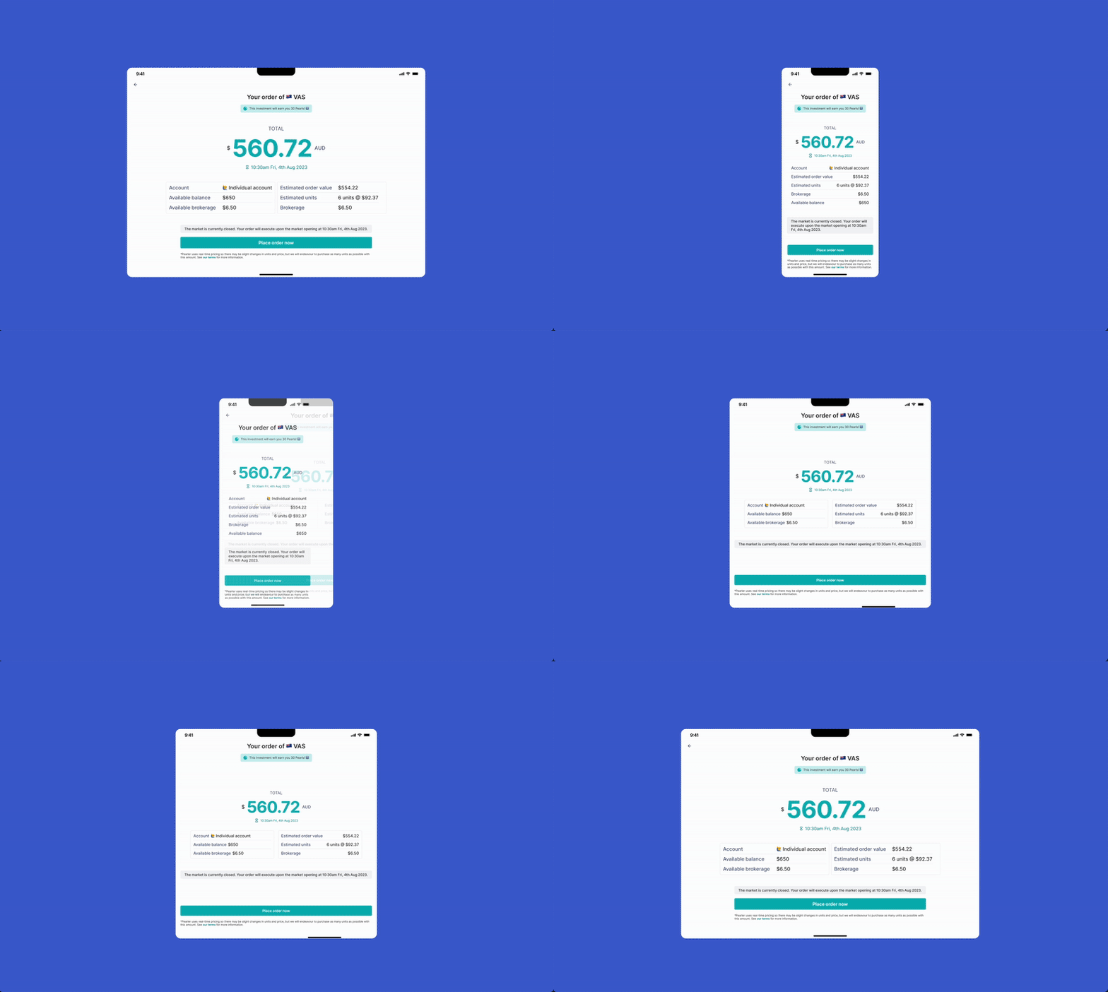
Responsive, mobile-first design
With 83% of users accessing Pearler on mobile, the existing experience had been designed mobile-first but with little consideration for desktop.
I maintained a mobile-first approach while introducing responsive layouts and scalable components that adapted fluidly across screen sizes. This ensured users had a consistent, intuitive experience whether on mobile, tablet, or desktop, helping them complete key financial actions with ease across devices..
impact
Bringing Pearler closer to their mission through design
01
Decreased customer support load
By simplifying complex flows and reducing user confusion, the redesign led to a noticeable drop in support tickets related to basic money actions. Users no longer needed to ask for help to complete what should be simple, everyday tasks.
02
Fewer social media complaints
Post-redesign, negative sentiment on social media significantly declined, helping to protect Pearler’s brand reputation and mission of making investing feel accessible and unintimidating.
03
Improved user confidence and task completion
The clearer flow and consistent patterns helped users complete key tasks—like buying or withdrawing funds—with more confidence and fewer errors, improving overall user satisfaction and retention.
04
Better internal alignment
With a system that matched the CPO’s vision and was built on thoughtful UX principles, teams were better aligned across design, product, and engineering, leading to more cohesive future development.
05
Scalability for future products
The updated design patterns and structure created a strong foundation for the rollout of new financial products like home buying and superannuation, enabling faster iteration and reuse of components across features.
Process
How research, exploration, and iteration shaped the product foundation

CURRENT STATE CHALLENGES
To understand where to begin I started by mapping the existing flows and screens.
I audited the experience through the lens of design best practices and uncovered a disjointed and inconsistent journey that was difficult to navigate and hard to scale.
The audit revealed fundamental issues in layout, hierarchy and interaction design which made even simple actions feel complex and prone to error.

user DISCOVERY
Users were struggling to convert motivation into action due to confusing, inconsistent flows
To build a deeper understanding of user pain points, I combined multiple sources of insight. I began by reviewing customer service tickets and conversations, and explored user discussions on Reddit and Pearler’s Facebook page.
Once I had a more solid understanding of some core pain points I conducted interviews with six users across a range of personas - some who had never invested to understand why, those who had invested recently, and active investors.
Across the research a few themes quickly emerged in some key pain points:
New investors were overwhelmed by information density
The UI lacked visual appeal and visual hierarchy
Error states were long-winded and poorly formatted, often 3–4 lines of dense text that users tuned out
Inconsistencies across flows made even basic tasks feel unfamiliar and clunky
The experience felt off-brand, failing to reflect Pearler’s promise of clarity and approachability

ways of working
Leaner processes, faster iteration, and tighter feedback loops
Unlike working at Atlassian, designing at a startup like Pearler was lean, fast, and informal:
🔄 Feedback came via Slack, Figma comments, and dot points in Notes
👂 I conducted frequent user interviews — mostly formal, but deeply insightful
🎯 Stakeholders (CPO, Head of Engineering) and team members were also users — and looped into every iteration
🧠 The customer service team doubled as research partners, sharing pain points in real time.
This meant fewer formal rituals, but faster, richer iteration — with real people at the core.
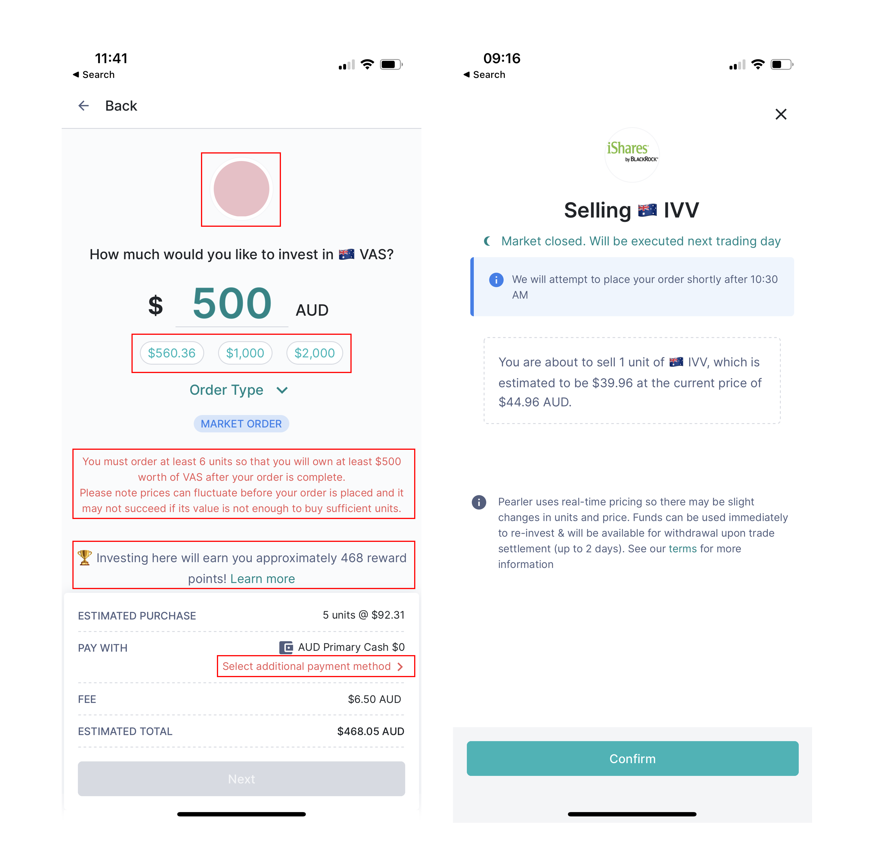
Opportunities
Auditing the original experience revealed not just usability issues, but opportunities to guide, inform and build trust.
While the flows were short in screen count, they were high in cognitive effort—offering little clarity or support at critical moments.
The invest flow lacked guidance, presenting users with dense inputs and tables without context. This became an opportunity to add scaffolding and simplify decision-making.
In the sell flow, a hidden call-to-action and unclear timeline led to user hesitation. This opened space to clarify next steps and highlight expected outcomes.
Regulatory error states were long blocks of unformatted text that overwhelmed users. By reworking these, I introduced hierarchy and digestibility without losing compliance.
Confirmation screens were visually bland and heavy on text, often causing users to abandon or second-guess their actions.
These became key touch points to reinforce confidence. Post-sell ambiguity about settlement timing drove support queries. This highlighted the need to set clear expectations and improve communication upfront.
Each friction point became a chance to redesign for clarity, confidence and continuity—turning moments of confusion into moments of momentum.
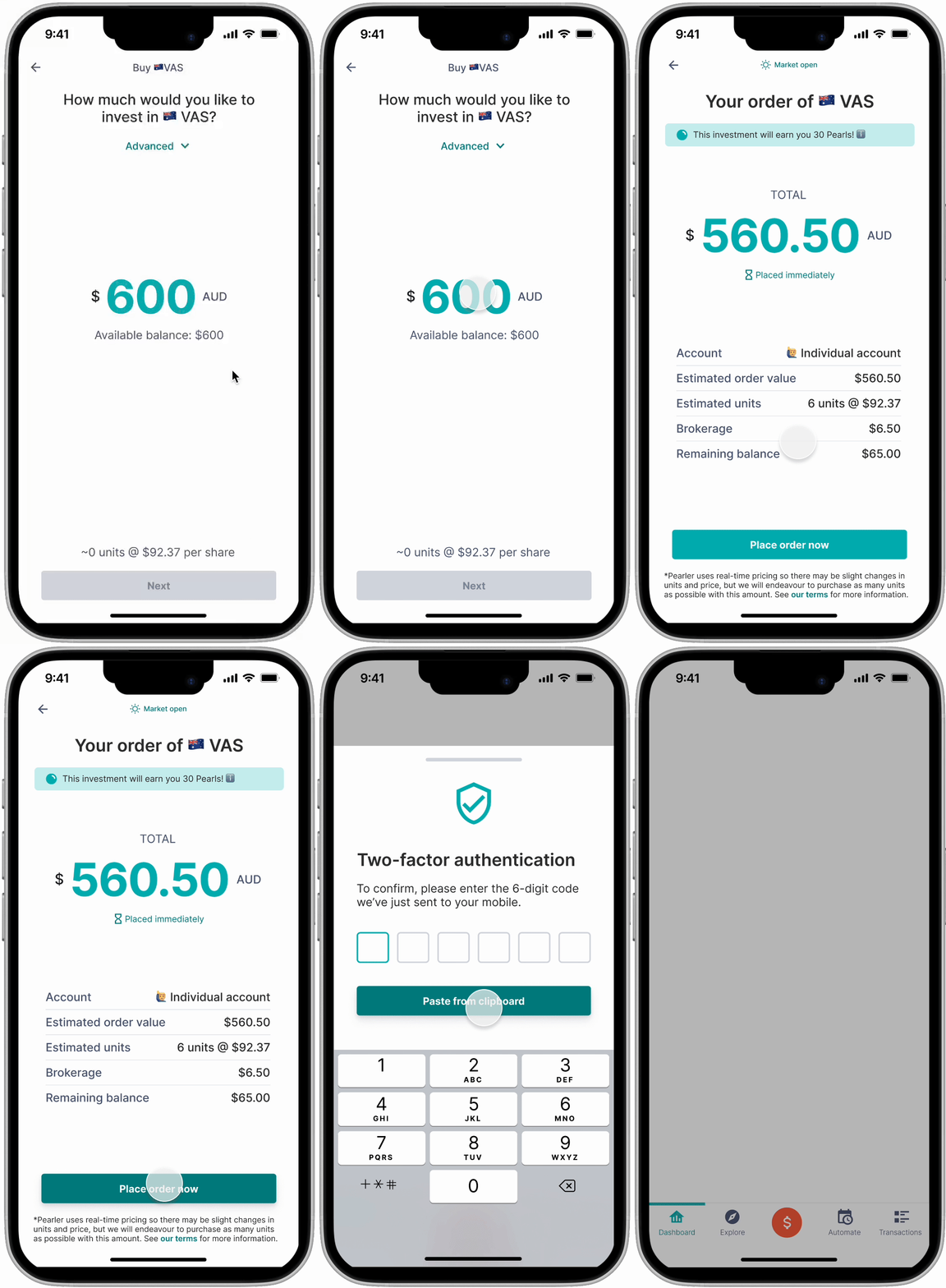
THE CHANGES
I redesigned both buy and sell flows with progressive disclosure and clarity in mind. While the number of screens increased, the mental load dropped significantly.
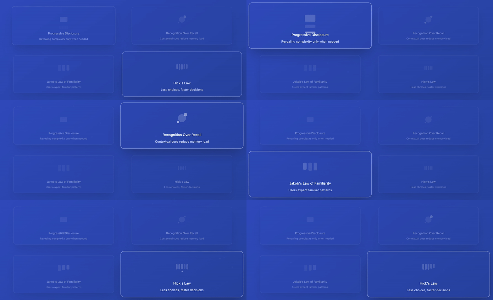
DESIGN PRINCIPLES
In the absence of a broader design team to collaborate with, I anchored my decisions in established design principles and heuristics to guide the redesign.
Progressive Disclosure helped simplify the buy and sell flows by revealing complexity only when needed, such as placing advanced options like limit orders behind expandable sections.
I applied Recognition Over Recall by introducing contextual cues like share price breakdowns and transaction timelines so users didn’t have to hold details in memory.
Jakob’s Law of Familiarity guided my use of common patterns from apps like Robinhood, CommBank Pocket, and Wise, helping users feel at home in an unfamiliar environment.
And by applying Hick’s Law, I reduced cognitive load through step-by-step flows that prioritised essential actions first. These principles ensured the experience remained intuitive and efficient, especially in a mobile-first context.
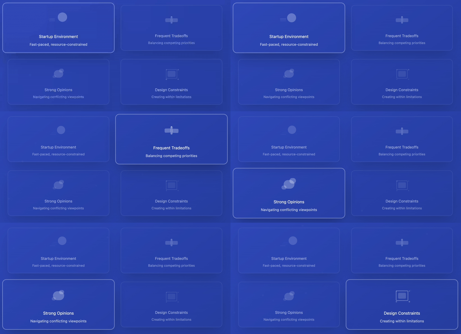
working with stakeholders
Working at a startup meant frequent tradeoffs — and often designing around strong opinions.
The founders had a clear vision of what they believed the customer wanted, which didn’t always align with the feedback we gathered.
For example, despite consistent negative sentiment around a gamified rewards program, it was included in the buy/sell flow. It consumed valuable space and distracted from critical decision inputs.
I worked around this by restructuring the layout to ensure key actions and guidance remained front and centre while placing the rewards UI in a lower visual hierarchy.
These moments taught me how to negotiate while protecting user needs, and how to frame insights in ways that still respected strategic business goals.

.svg)
