

MACQUARIE GROUP
Workflows are a customisable yet structured system that guide users through complex business processes and ensure accuracy, by simplifying task sequences and embedding clear steps for consistency and control.
%20-%20Panel%20Open.png)

background
Macquarie’s Treasury division manages multi-billion dollar decisions every day.
These important decisions and discussions happen across spreadsheets, dashboards, ad-hoc conversations, emails and Microsoft teams.
These overly manual and outdated processes meant that three different spreadsheets with the same formulas, used by three different team would produce three different values for the same piece of data. There was no single source of truth.
As a result, Australian Prudential Regulatory Authority (APRA) increased Macquarie’s liquidity coverage ratio holding back more than $6B dollars in operational capital.
The solution? The Macquarie Analytical Reporting System (MARS) - Macquarie Group's most ambitious digital transformation initiative, aiming to centralise and standardise treasury intelligence.
problem
Today, everything is manual.
Workflows is the solution to this. Designed to formalise business processes into structured, traceable, auditable steps, workflows allow users from analysts tracking numbers, to completing scenario analysis to enable the purchase of an airport.
Solution
Customisable yet structured system that guide users through complex business processes
01
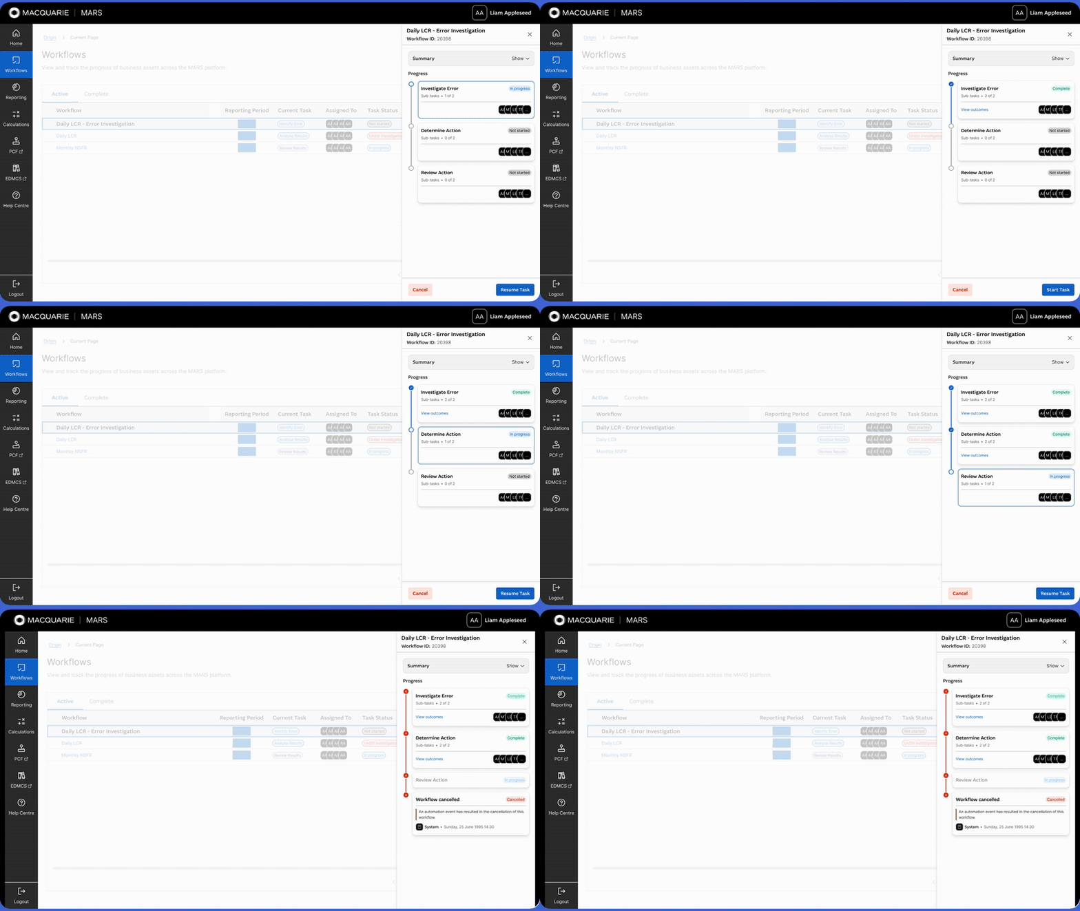
Clear, segmented and sequential tasks along a linear progress bar
For our MVP, the business process was simple—analysts would analyse a report, reviewers would approve or reject it, and outcomes would either be published or sent back for revision.
To bring structure and clarity to this flow, we broke the workflow down into clear, segmented tasks laid out sequentially.
Combined with a linear progress bar in the overview, this made it easy for workflow owners and reviewers to instantly understand where a task was in the process, what had been completed, and what was still to come.
By visualising the workflow step-by-step, we reduced the cognitive load on users, supported faster decisions, and built a foundation that can flex as business needs grow.
02
Retain context while doing work
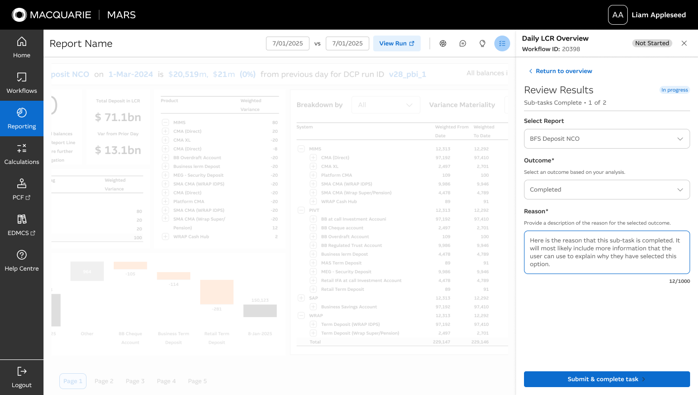
To help users stay oriented while completing tasks, I landed on a side panel layout that keeps the relevant asset visible on the left while workflow actions appear on the right.
This means analysts, reviewers, and owners can reference key information without switching tabs or losing their place.
Whether they're reviewing a calculation or approving a submission, users can stay focused and make decisions faster—because everything they need is accessible in view.
It's a simple layout shift that makes a big difference in reducing context switching and improving task accuracy.

03
Navigate relevant information and assets
To support users unfamiliar with a workflow, we added components to the overview that help them quickly get up to speed without having to search for information independently.
As we scaled beyond the MVP, we introduced the ability to link directly to related assets—such as reports, documentation, or external tools—ensuring users always have access to the context they need.
Because workflows often involve hierarchical decision-making, this centralized overview helps users understand decision layers and dependencies at a glance, allowing them to navigate complex flows and take informed action faster.
04
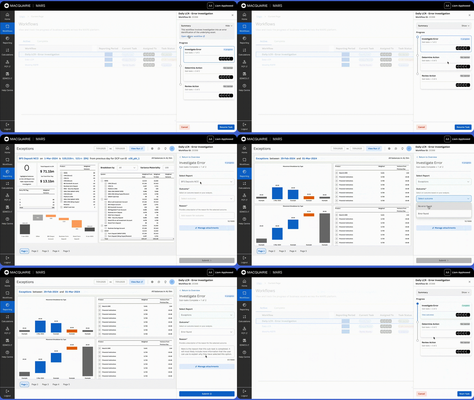
Structured, easy-to-complete forms with predefined outcomes
By introducing structured, easy-to-complete forms with predefined outcomes and clear instructions, we helped standardise how tasks are completed within a workflow.
This ensures consistency, reduces ambiguity, and makes auditability straightforward by automatically capturing the user and action metadata.
For scaling past the MVP, this form is configurable per each workflow. Need to allow attachments? You can add them in. Want to add multiple outcomes? Add another in.
This flexibility allows teams to tailor fields, outcomes, and input requirements to suit their specific processes—ensuring the workflow remains both adaptable and audit-ready as needs evolve.
%20-%20Panel%20Open-1.png)
05
Scalable and re-usable patterns
While the MVP use case was relatively simple, we needed to design with long-term scalability and reusability in mind.
Workflows, as a core feature, must support a wide range of business processes—from straightforward tasks to highly complex operations.
To achieve this, we focused on establishing flexible, modular patterns that could accommodate varying levels of complexity and be reused across multiple contexts.
While the initial use case was straightforward, we designed the task segmentation and progress tracking with future complexity in mind—ensuring the structure could accommodate branching workflows, multiple assignees, and conditional logic as the product scales.
06
Accessibility-first
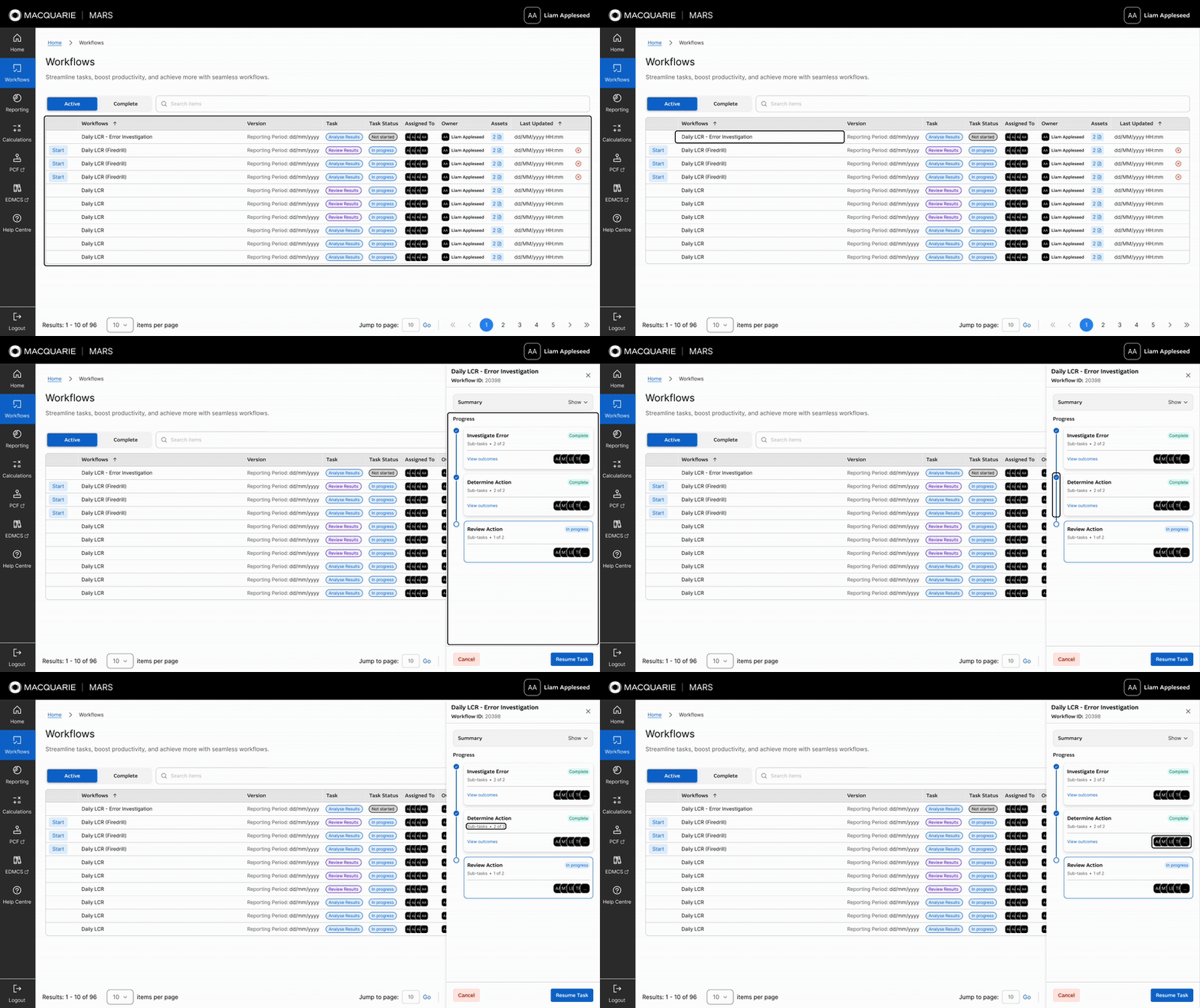
As with all the work I do, the design goes beyond colour contrast to focus on fundamental structural and hierarchical clarity.
We used semantic HTML elements like proper heading levels to create an accessible content hierarchy.
Keyboard navigation and screen reader paths were carefully mapped out and documented during handover, with thorough QA testing treating accessibility issues as blockers to completion.
Additionally, form-based screens employ accessible behaviours and clear, concise language to ensure users relying on screen readers or keyboard navigation can fully understand and interact with the workflow—avoiding keyboard traps or confusing terminology throughout the process.
impact
Introducing structure, visibility, and auditability to complex processes has...
01
Reduced Risk and Increased Auditability
Structured steps, embedded documentation, and clearer ownership reduced compliance risk and made auditing easier.
02
Faster Updates, Fewer Mistakes
Stakeholders could safely update workflows without needing a deep technical understanding.
03
Stronger Ownership and Oversight
Process owners had clearer visibility into who was responsible for what, and when.
04
Centralised Communication
All task-related notes, status updates, and documentation lived in one place.
05
Better User Experience
A simplified interface helped users complete complex processes with more confidence and fewer errors.
06
Positive User Feedback
Users preferred the new system, appreciating that all related tasks and communications were now streamlined.
the Process
Business DISCOVERY
Business discovery was conducted to understand strategic priorities, requirements, and challenges, enabling the design of a solution aligned with current needs and future growth.
starting point
MARS was built from scratch with a tight six-month deadline to deliver the MVP.
As MARS is being built 0 > 1, there was no existing UI to enhance. While the blank slate offered seemingly endless creative potential, the reality was a tight six-month timeline to deliver the 1.0 release—alongside several other features that also needed to be researched, designed, and developed within that window.
speaking to stakeholders
To start, I engaged with key stakeholders and reviewed business documentation to define current goals, future objectives, and needs shaping both the MVP and long-term direction of MARS.
To set a strong foundation, I worked to understand the organisation’s broader business objectives through direct engagement and a review of key documentation. I spoke with:
-Product owners
-Senior managers
-Directors
-Representatives from various business teams
These conversations, supported by an analysis of business strategy documents, roadmaps, and compliance requirements, helped to:
- Establish the current business goals
- Define the scope for future objectives
- Uncover the needs that would shape both the MVP and the long-term direction of the platform
This collaboration ensured the solution addressed the needs and expectations of all key parties while staying aligned with the organisation’s strategic priorities.
business documentation
I reviewed business process maps, standard operating procedures, and daily work artefacts to understand current workflows and compliance needs guiding the product.
As part of understanding the business goals, I reviewed available documentation including business process maps and high-level standard operating procedures. These artefacts provided insight into how day-to-day work was structured and highlighted existing workflows.
While I did not have direct access to broader strategy documents or OKRs, these materials offered valuable context around current processes and compliance considerations relevant to the product. This review helped ground the design work in real-world business operations and regulatory requirements.
the business goal
The primary goal of the workflows feature is to enable teams to standardise and automate business processes across the organisation.
It is designed to empower any team to log into MARS and create automated workflows that manage their day-to-day tasks, especially those which require auditing.
By providing a structured, consistent way to document and enforce process steps, workflows ensure greater control, compliance, and efficiency throughout business operations.
FUTURE PLANNING
To build a scalable, fit-for-purpose solution, I focused on understanding how future customers, their teams, and processes would use and be onboarded onto the platform.
Although the initial scope focused on a small MVP use case, it was essential to consider the platform’s long-term goals by understanding the diverse teams and processes that would eventually need to be supported within workflows.
Stakeholder discussions extended beyond immediate project objectives to include future team use cases, ensuring the platform could effectively onboard new teams and their processes.
Gaining a deep understanding of how these teams operate was key to delivering a solution that met current needs while remaining scalable and sustainable as the product evolved.
technical DISCOVERY
Technical discovery enabled me to design workflows that leveraged the capabilities of Unqork, aligned with existing architecture, and scaled to future needs while staying within the project’s constraints.
Technical Feasibility
I collaborated closely with developers and product owners to assess Unqork’s capabilities, backend integration needs, and infrastructure readiness, ensuring the MVP was both technically viable and aligned with platform constraints.
To begin, I partnered with developers and product owners to conduct technical discovery and understand the technology that would underpin the solution. Through these conversations, I learned that Unqork would serve as the platform, so I explored its capabilities, constraints, and how it would integrate with existing backend architecture.
This included reviewing infrastructure readiness, identifying potential integration complexities, and testing what could realistically be achieved within those parameters. These insights directly shaped the MVP for the “Analyse Results > Review Results > Publish” workflow, ensuring the solution was technically feasible from the outset.
Scope & Timelines
Working within a tight six-month build and shifting requirements, I designed workflows that could scale to greater complexity without compromising scope or timelines.
The MVP (1.0) focused on the Daily LCR Analysis, establishing the pattern of Analyse Results > Review Results > Results Ready.
In version 1.1, the Calculation Peer Review maintained the pattern while adding a review and approval step for calculation changes.
Later, the “Error Identified with Daily LCR Analysis” use case expanded the model further by introducing blockers, dependencies, and parent–child process relationships.
user DISCOVERY
I validated and updated outdated user research through direct engagement, collaborative workshops, and iterative testing with stakeholders to ensure workflows met real-world needs.
existing research
I reviewed and validated existing research, uncovering gaps that required direct user engagement.
When I joined, I was provided with existing documentation outlining user personas, roles, and needs. But it quickly became clear that this information didn’t reflect the current state. Much of it had been created through biased research practices by business analysts or had become diluted as it was passed verbally from person to person over time—losing key context and accuracy.
This gap reinforced the need to validate and expand on the existing research by speaking directly with users, ensuring the workflows solution was grounded in their actual day-to-day processes and pain points rather than outdated or second-hand assumptions.
new research
I ran a workshop with users to map real processes, uncover pain points, and align on needs.
To close the gap between outdated documentation and current reality, I organised and facilitated a workshop with the first group of intended users. The goal was to capture an accurate picture of their day-to-day processes, from routine tasks to exceptional cases, and to map these against the broader business workflows.
Through collaborative discussions and process-mapping exercises, we identified friction points, inefficiencies, and workarounds that had never been formally documented.
These insights not only clarified user needs but also helped shape design priorities for the MVP, ensuring the solution addressed both functional requirements and the lived realities of the people who would use it.
findings
Captured current and future user journeys, surfaced distrust from past failed platform rollouts, and identified edge cases to design workflows resilient to real-world complexities.
The workshop uncovered several critical insights that helped align the design with real-world needs:
Current and Future User Journeys – Mapped the full current-state process and identified how it could scale into a future-state workflow model.
User Sentiment and Trust – Many users expressed frustration at being “sold” on new platforms in the past without seeing meaningful outcomes, highlighting the need to deliver visible, tangible value early. Implementing the wall helped in improving this.
Edge Cases and Failure Scenarios – Documented exceptions and potential points of failure to ensure workflows could handle errors, unusual situations, and process deviations.
concept exploration and Delivery
I conducted broad visual research and pushed platform limits through close collaboration with developers, creating scalable, user-centered workflows that balanced design ambition with technical constraints.
visual exploration
With no existing interface to build from, I explored visual patterns from finance software, activity logs, and forms to inspire workflow concepts, ultimately shaping a single cohesive design in collaboration with developers.
Because MARS had no existing interface, I began with a broad visual exploration to understand how similar problems were solved elsewhere.
I drew inspiration from Dribbble, established financial software, and tools featuring workflow-like processes such as activity logs and complex forms. From this research, I developed a range of design concepts that could map well to MARS’s needs.
technical contraints
By working within Unqork’s rigid design constraints, I partnered with developers to extend its capabilities, enabling a richer, more intuitive workflow experience.
Given the constraint that all visuals had to be built in Unqork, a no-code platform with limited design flexibility, I collaborated closely with developers to stretch what solution I could deliver.
Together, we co-developed a custom React wrapper that allowed for more refined visuals and interactive elements. This technical uplift enabled the creation of a side panel interaction model, allowing analysts to review and submit tasks without navigating away from the workflow.
We also introduced progress states, summaries, and task cards, resulting in workflows that were not only visually coherent but also streamlined and efficient for end users.
collaboration
I collaborated with users, stakeholders and the product team through iterative testing to refine workflows and ensure alignment.
Following the initial workshop, I kept users actively involved throughout the design process. Each iteration of the workflows feature was shared for feedback, whether through informal check-ins, structured usability testing, or walkthroughs with stakeholders. This constant loop of input allowed us to validate design decisions early, adapt to emerging needs, and catch potential issues before development.
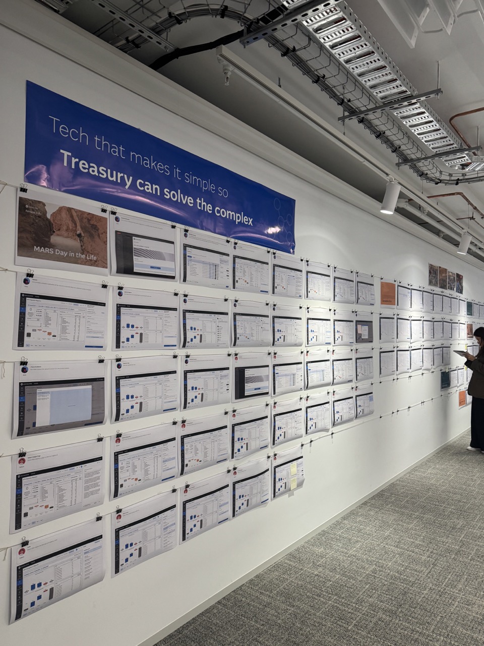
Stakeholders remained engaged at each stage, ensuring that evolving designs continued to meet business objectives while staying grounded in practical, user-centred realities. This approach fostered ownership among users, smoothed adoption, and increased confidence that the final solution would work in the real world from day one.
walk the wall sessions
Our most successful feedback method involved meeting at the wall to review printed designs, add sticky notes with comments, and returning the next day with updated refinements.
We introduced frequent ad hoc and scheduled “Walk the Wall” sessions, where we guided stakeholders through either end-to-end user journeys or specific feature flows. These sessions were initiated after we found that standard Figma walkthroughs weren’t effective—stakeholders were getting lost in the details and struggling to engage with digital designs.
Walking through the printed screens in person made the designs more tangible and approachable, helping stakeholders better understand the flow and feel confident leaving direct, actionable feedback. This approach enabled faster alignment between design intent and technical feasibility, while also ensuring broader buy-in before moving forward.
Accessibility
I ensured I built inclusive interfaces using iconography, keyboard navigation, and screen reader support

Accessibility was embedded throughout the process. Considerations included using icons alongside colour to convey status, ensuring that key information wasn’t lost for users with colour vision deficiencies.
I also considered how screen readers and keyboard navigation would traverse the interface, particularly on complex screens like the overview and task views, to ensure an inclusive and seamless user experience.
handover
I provided detailed design documentation, collaborated closely with developers and QA throughout build, and iterated to ensure a seamless, high-quality delivery.
For a smooth handover, I leveraged Figma’s Dev Mode to provide developers with detailed annotations covering everything from pixel-perfect visuals to interactions and edge cases. This thorough documentation ensured the development team had clear guidance on design intent and functionality.
Beyond handing off designs, I maintained close collaboration with developers throughout the build process, addressing questions in real-time and iterating on designs as needed.
I also worked closely with the QA team to verify that all edge cases and error states were identified and thoroughly tested, ensuring quality and consistency in the final product.
This continuous involvement helped bridge the gap between design and development, minimizing misunderstandings and supporting a seamless delivery.

.svg)
