

MACQUARIE GROUP
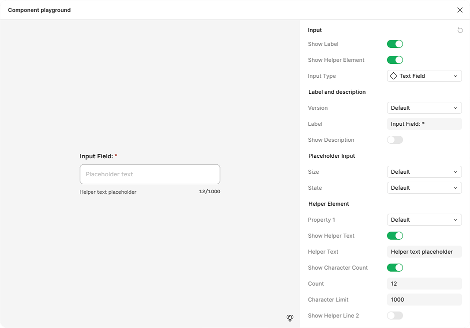
The Macquarie Design System is a scalable yet flexible framework that standardises UI components and patterns, enabling faster delivery, brand consistency, and accessible experiences across diverse internal platforms.


MACQUARIE GROUP
The Macquarie Design System is a scalable yet flexible framework that standardises UI components and patterns, enabling faster delivery, brand consistency, and accessible experiences across diverse internal platforms.


Problem
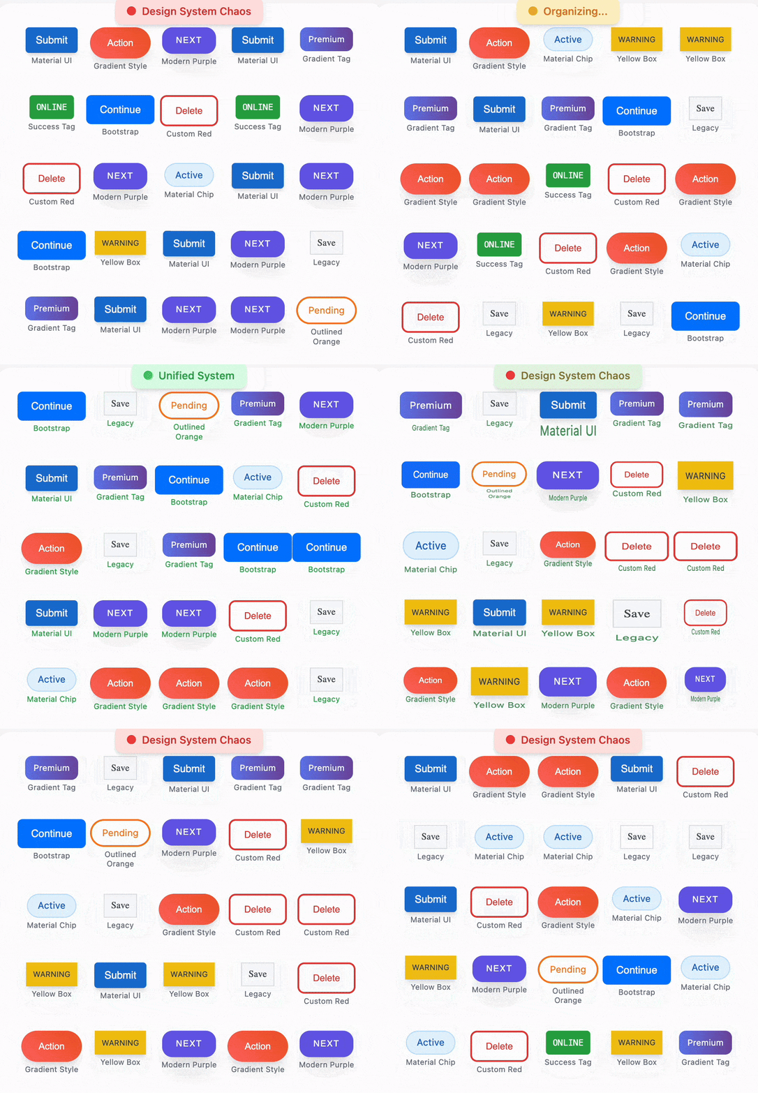
Macquarie’s internal-facing platforms were plagued by inconsistency over 400 platforms with no design system.
Components like buttons and tags appeared in more than 400 different products, built on top of multiple fragmented local design systems. These were often misaligned in both structure and visuals—some divisions even used Material UI with none of the core Macquarie branding foundations like colour or typography.
The result was a messy, disjointed experience that increased design time, caused confusion, and created unnecessary mental load when switching between platforms.
The GEL initiative aimed to accelerate design across Macquarie by reducing duplication, enforcing consistency, and simplifying the cognitive overhead of switching between tools and contexts.

My role
Originally hired to support the 0 > 1 build of MARS, my role quickly expanded to focus on scaling the design system.
At the time, the system included only a logo, button, and tag. Over time, we grew this into a 30-component system, designed using an atomic model that could flex across divisional branding requirements.
Components were crafted initially for MARS (the Group Treasury (GT) platform) based on best practise and research, and were then adapted.
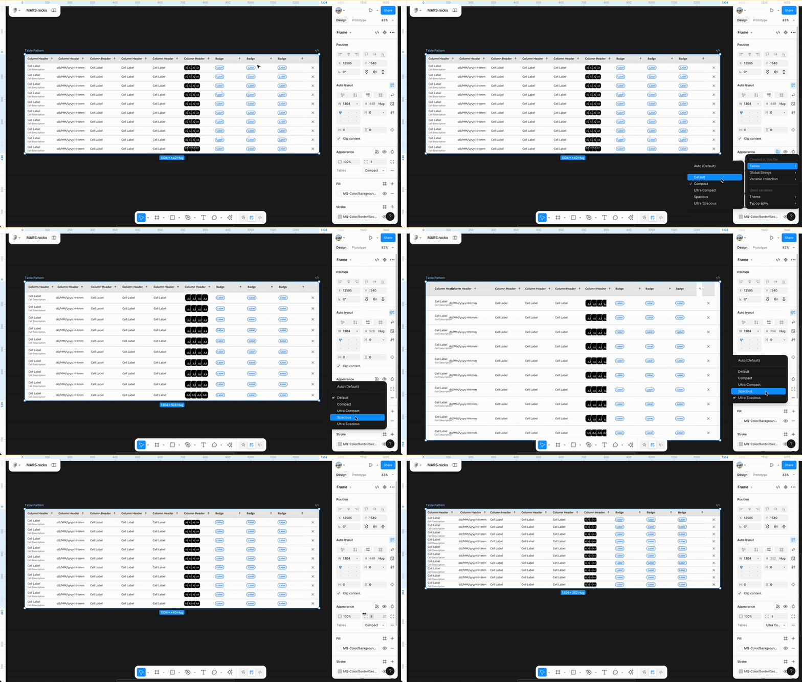
The adaptation process involved using Figma modes whcih defined Macquarie Brand variables which allowed automatically adjusting between GEL and MARS components. Turning on this mode automatically adjusted elements like corner radius and typography to meet specific brand restrictions—such as 0px radii and regulated font usage.
Designing the system
As a team, we grounded our approach in three core principles: consistency, usability, and accessibility.
While we initially worked from a component roadmap, we quickly realised it was more efficient to design components in response to emerging needs during our day-to-day work in GT.
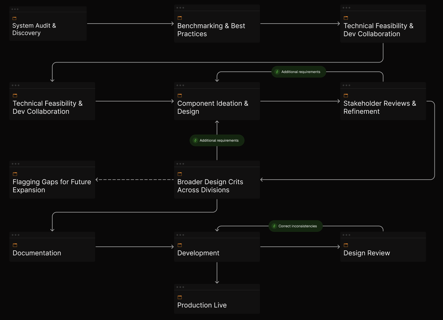
For each new component, I began with a system-wide audit across Macquarie, interviewing lead designers from different projects and divisions to uncover pain points, requirements, and edge cases. I then conducted competitor analyses to benchmark usability and accessibility (WCAG 2.1) best practices.
In parallel, I partnered closely with developers to understand technical constraints, existing frameworks to be leveraged to ensure seamless implementation. With this foundation, we could then move into component ideation and design in Figma.
Designing the component experience
The designer experience was a key consideration in how I built each component.
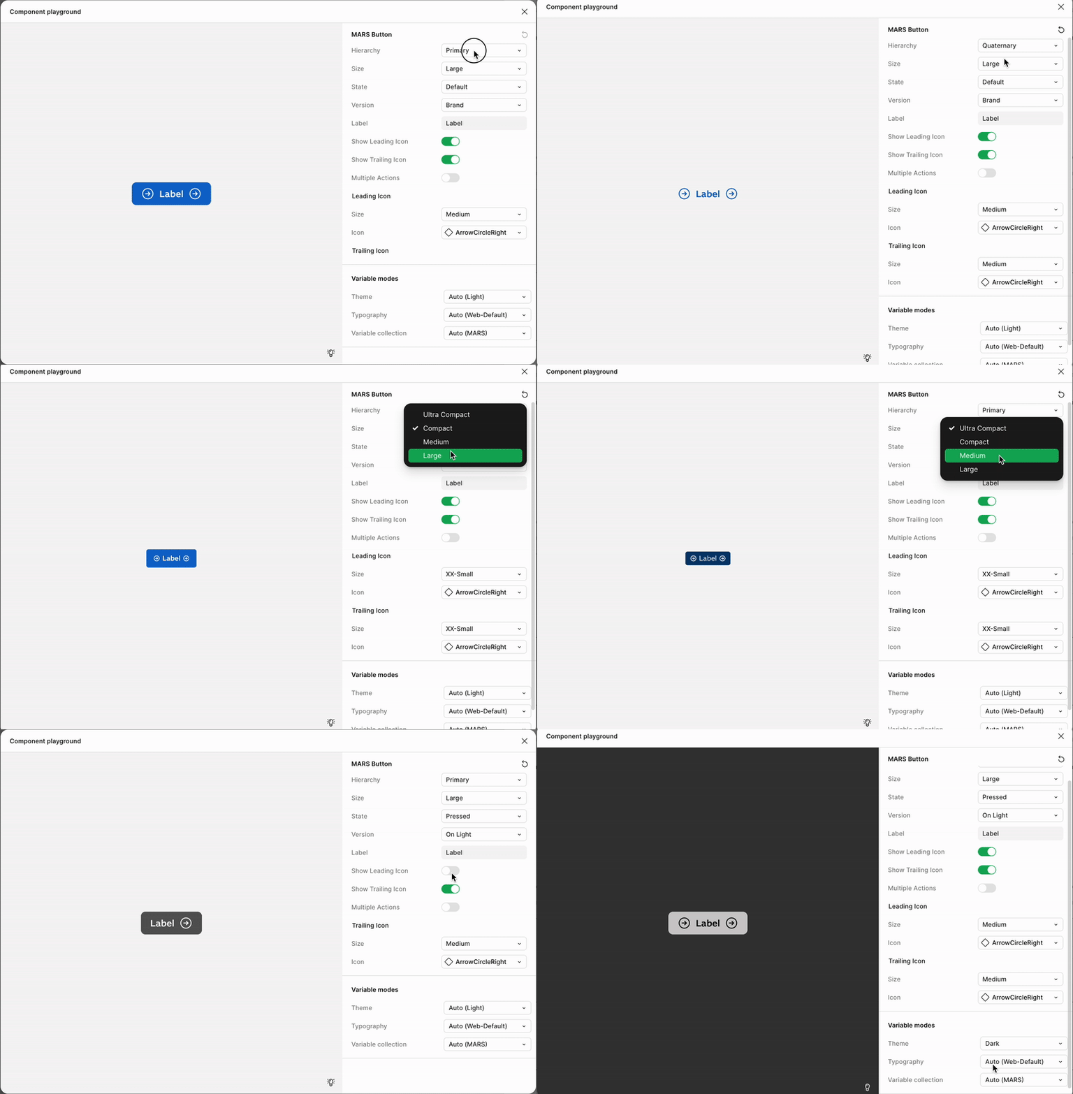
By embedding best practices, accessibility guidelines, and technical requirements directly into the design system, we reduced ambiguity and made it easier for designers to work efficiently and consistently.
Components were built with clear presets—such as padding, corner radius, and interaction states—while still allowing controlled flexibility through variables like size, colour, icon placement, and label text. This balance ensured designers could meet the unique needs of their product without detaching components or creating one-off solutions.
By limiting the need for manual overrides and aligning interaction patterns across components, we created a system that felt intuitive to use, scalable across teams, and resilient to fragmentation.
Iteration
Each component went through a rigorous review, validation, and refinement process
After the initial iteration of each component, it was presented to the Head of Design, the Design Systems Lead, and the broader GEL engineering and product team for review. Feedback was gathered, refinements made, and final approval given before moving into broader distribution.
To ensure relevance across Macquarie’s varied product landscape, we also ran components through cross-functional design crits with lead designers from different divisions. This helped validate that components were truly fit for purpose. In cases where niche or highly complex use cases emerged—such as advanced trading tables—we documented the gaps and flagged them for inclusion in future design system expansions.
documentation
Clear documentation and developer tooling ensured accurate, accessible implementation.
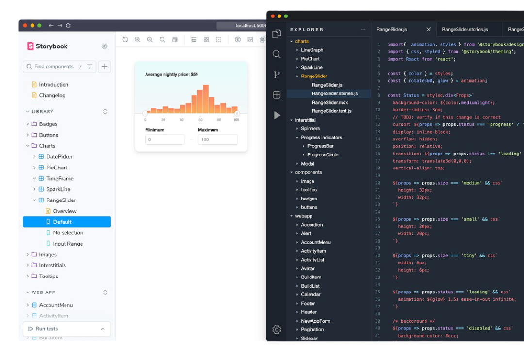
Once approved, I completed the accessibility documentation, while broader system documentation was handled by the Design Systems Lead. We relied heavily on Figma DevMode to surface implementation details like spacing, token usage, and interaction specs for developers.
Developers would then build out the Storybook and review with myself to ensure they were to spec.
What I would do differently
My learnings
If I were to do it again, I’d start by evaluating the existing ways of working and collaborating with the team to determine the best approach—whether agile, waterfall, or a hybrid—to suit our context.
I’d also avoid treating large, public design systems as gospel; while useful for reference, many lack depth or usability and shouldn’t dictate our solutions. Instead, I’d focus on building a system grounded in real team needs, with earlier investment in dedicated contributors and a plan to integrate living documentation directly in Figma to keep guidance accurate and accessible.
impact
Streamlined design and development processes, cutting costs and accelerating product delivery across multiple teams.
01
Accelerated Design and Development
By providing a comprehensive, reusable library of components aligned with Macquarie’s brand standards, GEL significantly reduced the time designers and developers spent creating and refining UI elements from scratch.
02
Reduced Front-End Developer Load
With GEL handling core UI patterns and components, front-end developers were freed from building and maintaining design system elements. This allowed them to focus more on delivering product features and business-critical functionality, increasing overall engineering productivity.
03
Cost and Resource Efficiency
By minimizing duplicated efforts across multiple teams and projects, GEL lowered development costs. Conservatively, reducing design system build and maintenance time by front-end engineers could save several full-time equivalent (FTE) months annually, allowing reallocation of resources to strategic product development.
04
Improved Consistency and Quality
GEL ensured uniformity across 100+ internal tools and platforms, reducing visual inconsistencies and usability issues that previously increased bug fixes and support overhead.
05
Faster Onboarding and Collaboration
Standardised components and patterns improved cross-team collaboration and reduced the learning curve for new team members, speeding up onboarding and facilitating smoother handoffs.